
Living in a high-paced world that is also a tech-centric one has brought on a massive change to the marketing and advertising industries. Digital marketing has become the primary tool for product and service promotion, greatly surpassing all forms of traditional marketing.
However, when it comes to grabbing people’s attention and encouraging consumers to step into your store, the best tool you can use is the good old-fashioned signage. It has been around for decades and is still an effective marketing tool today.
Your store’s sign is one of the first things people see, so designing one that leaves a good first impression is crucial. Those that have an eye-catching yet simple design and utilize bright colors are more likely to bring you positive results, so here are the most popular types and some basic design tips to help your business stand out in a crowd and attract more people.
The Different Types

-
Non-Illuminated Channel Letters
Channel letters involve using individuals characters or logos that are then installed to create a single sign. They are usually placed on a building’s exterior, more specifically the facade and come in a variety of depths you can choose from. They can be made of aluminum or acrylic and can even be painted to contrast your facade nicely or match your brand colors. These types are perfect if you do not want or need any lighting.
-
Face-Lit Channel Letters
They utilize an identical installation style and depth variety as the previous type with the difference being, as the name suggests, that they contain internal lighting that illuminates the face of each letter. This will make your signage noticeable even at nighttime. They use LEDs for lighting which come in a variety of hues and the letters are usually made from translucent acrylic.
-
Back-Lit Channel Letters
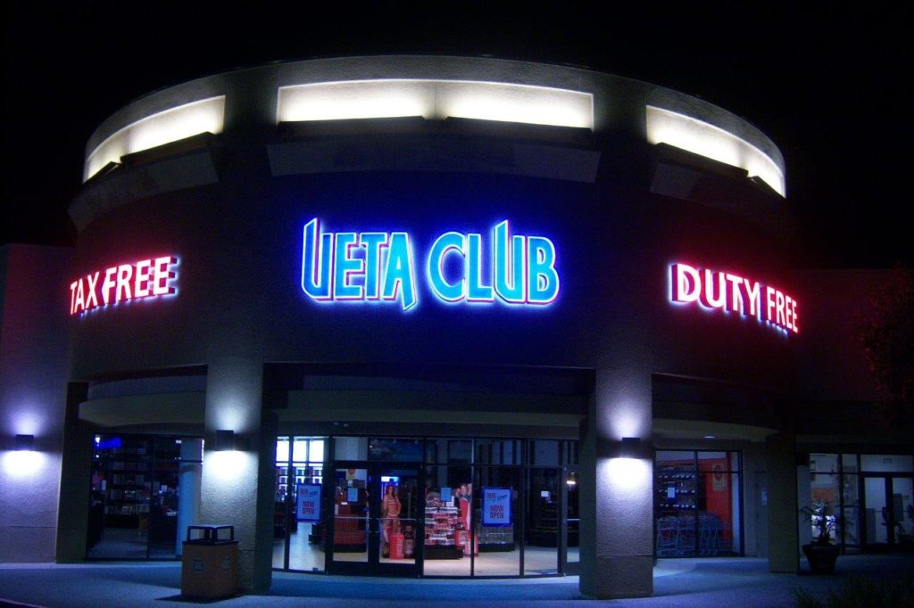
Illuminating the signage from the back gives it a dim glow due to the light being projected onto the wall. This is why they are also referred to as reverse-lit or halo-lit channel letters. They are perfect if you would like to give off a certain aura around your storefront or create some kind of atmosphere. The letters are usually made from aluminum and the light creates a negative space at night, making it even more impactful.
-
Blade Signage
These types are usually held by a pole and supported by a decorative bracket or frame system. It is usually used to immediately catch someone’s eye and can come in both lit and unlit versions.
-
Interior Signage
These can greatly add to your space’s decor while providing various information to your customers such as where to go or how to find what they are looking for. Lit interior signage can attract customer’s interest in a certain product and they can also create an atmosphere within a space. All of this will boost your professionalism and surely impress your consumers or clients.
Other types include neon, high-rise, pylon, and monument signage. Some companies specialize in producing a single signage type while others, such as nordiksign.dk specialize in several different ones.
Design Tips You Should Have in Mind
-
Choose Your Colors and Graphics Carefully
Using bright and saturated colors and graphics will create something memorable. Your branding should be reflected in your design and the colors you use should not only be eye-catching and instantly visible but also ones that define your brand.
Avoid light and pastel colors and stay away from trendy ones since they might quickly go out of style, requiring you to change your signage. Giving your design longevity is definitely something you should strive towards.
-
Contrast Matters
Creating a contrast between your design and the backdrop is important. It will make your sign clearer and more distinguishable even from a further distance. Remember that you only have a few seconds to catch a potential customer’s eye so creating something simple but that pops out due to the contrasting background is necessary. Choosing the most appropriate lettering is critical to the success of your sign. If you are unsure of the different fonts available, you can check out this custom tool on Customneon.com.
This means never pairing similar colors but instead using, for example, a dark backdrop and light lettering or vise versa. You should consider adding a border around your design since it also adds to the visibility.
-
Pay Attention to Your Typography and Message
Creating contrast is not the only factor that increases the legibility of your signage. Stay away from cursive fonts or any others that are hard to read. Bold lettering is another great option, but italics should be avoided at all costs. It is also best to use as few words as possible to avoid creating clutter and confusion.
-
Do Not Hesitate to Go Big
The larger the letters, the bigger the visibility. However, it is important to consider the position and the placement location when deciding the size of your signage. Bibi LED offers screens in different sizes for your signages.
There are also many typefaces to choose from but they will also affect the legibility. Although a certain typeface might go well with your brand, it might not be visible from a greater distance.
If you are unfamiliar with what typefaces are, they are a set of characters such as letters, symbols, and numbers that have the same design. Do not confuse them with fonts since they are just a specific style and size of a typeface.
-
Consider Whether to Feature Your Logo
Featuring a logo might be a great idea if you have a lot of available space to work with. It is also great if it is something unique and you would like for it to become recognizable and instantly associated with your business.
On the other hand, if you are working with limited space, it is better to invest more time and resources into designing the perfect look for your name and message.
Conclusion
Take your time to create a design that is memorable in its simplicity. Pay attention to the contrast, scale, and size and go for something that truly reflects your brand. Signage has the power to boost one’s business and revenue, but only when it features a great design.
")


